Silverlight 4.0 Tutorial (7 of N): Visual States
Read Previous Posts: Part1, Part2, Part3, Part4, Part5, Part6
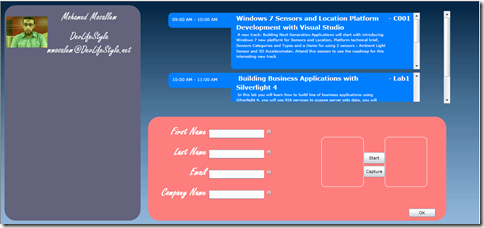
Continuing our registration booth application, i did some changes to the application UI, here’s how the application look like right now
- As you can see i removed the navigation features in the application, we will keep it as a one simple xaml page, i also changed some colors (excuse my poor color picking skills).
- After looking at the UI i think that the agenda is not taking enough space, the lower DataForm is taking more space while this DataForm is needed only when someone wants to register, the focus of the default UI should be the agenda and the registered attendees, so we need to make the DataForm invisible and show it on demand, this is pretty easy to do, first i will add a button to view/hide the DataForm.
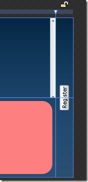
- I will add a new column to the LayoutRoot grid and put the button inside this column, i will also add a simple rotate transform for this button
- The button should look like this
- First we need to hide the lower DataForm and expand the agenda to span two rows, then in the button event handler we need to show the DataForm and change the agenda back to span one row only. we can write the code immediately in the button click event handler or we can make use of Visual States (more details on States here), apparently our form has two states the first state (the default one) is when we are showing the attendees list and the event agenda; the second state is when we are showing the attendees list, event agenda and the DataForm.
- In Blend you can easily create these two states, in one of the tool windows in Blend (the one that has the projects tab) you will find a tab called States
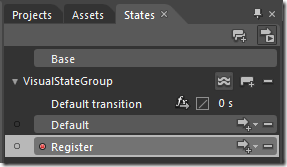
- The states tab is empty because we don’t have states yet, to add state you can click the small icon (surrounded by red rectangle in the image above) the tooltip on the icon says “Add state group”, a state groups is just a way to group states together. so we will click this icon to add a new state group
- As you can see in the image above, the new state group is called VisualStateGroup you can change the name if you want to; We will add two states in this group (by clicking on the icon surrounded by red rectangle), we will name them Default and Register.
- Starting with the Default state, in this state the DataForm should be hidden and the agenda should span two rows, to do this all you need is to select the Default state and do the necessary changes in the UI, whatever you change in the UI is saved in this state, as you can see at the top of the designer window a message saying that state recording is on
- So select the Default state and change the Visibility of the stack panel that contains the DataForm and the colored rectangle (rectAttendeeDataFormContainer) to collapsed, and for the agenda items control change its RowSpan property to 2
- Select the Register state and change the Visibility of the stack panel that contains the DataForm and the colored rectangle (rectAttendeeDataFormContainer) to visible, and for the agenda items control change its RowSpan property to 1, for the register button change its visibility to collapsed.
- Now we need to start the application in the Default state, to do this add the following line of code in the constructor of the page
- public Home()
- {
- InitializeComponent();
- VisualStateManager.GoToState(this, "Default", false);
- }
We use the VisualStateManager (the component responsible for managing the different states) to go to the Default state
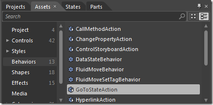
- On clicking the button we will go to the Register state, we can do this by calling the VisualStateManger.GoToState method in the button event handler; another way of doing this if you do not want to write code is to use Blend behaviors, under the Assets tab select Behaviors, you will find a behavior called GoToStateAction
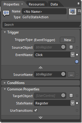
- Drag and drop this behavior on the button, go to the properties of the behavior you will see that this behavior action will be triggered by the button click event; you have to choose the Register state from the dropdown list
- Run the application, initially the DataForm is hidden because we are in the Default state, click on the Register button to go to the Register state, the DataForm will be shown
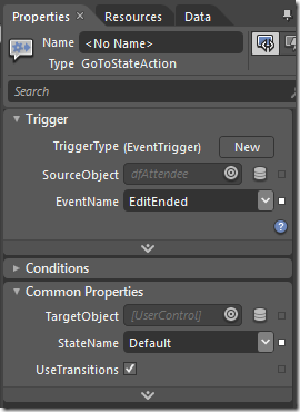
- After the user registers a new attendee we should go back to the default state, we can do this by using the GoToStateAction behavior we used earlier, drag and drop this behavior over the DataForm, change the properties of the behavior by setting the EventName to EditEnded and the StateName to Default
- Try the application again, click the Register button, the application will go the Register state. enter the necessary information and click Ok, the application will go back to the Default state.
That’s it for this post, we will continue in the next one.
Download the source code from here





Comments